Securely and Easily Share Files from Google Drive
Discovery
Before I could really dive into this project, I needed to understand the problem space. I briefly talked with our product manager and got a high level overview of the project. I wanted a better understand of who we were serving with this project, why they needed it, their motiviations, technical limitations, and a variety of other questions to understand the problem we were solving. So I spoke with our sales reps to understand the customer and our engineers to understand the limitations of how Virtru would work with Google Drive.
I started to piece together a requirements document. After a few meetings individually and together, we eventually settled on a list that included some of these:
Requirements
- Users can encrypt/decrypt files on Drive
- Users can adjust security parameters of encrypted files
- Share and manage using Google Drive interface
- Experience needs to fit Google Drive
Audience
- Corporate Environments
- Employees, non-technical
Audience Goals
- As an employee, I want to be able to securely share a file with a client and control how he accesses that file.
- As an admin, I want to be able to set DLP rules so that my users don’t have to worry about when or how to protect files on drive
- As a person in a regulated industry, I want to use Drive to share files with my team without violating any government regulations.
Understanding the user’s experience
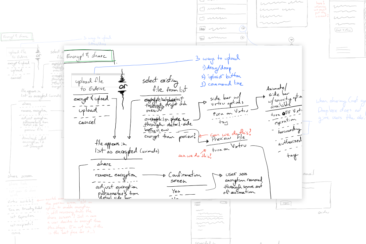
Collaborating with the team, I put together a map about the user’s experience to generate a general consensus around core experiences and work out any obvious issues around technical limitations, business objectives, and user experience.
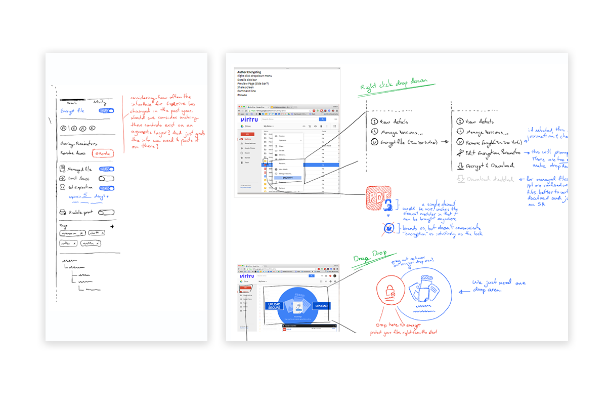
Moving along quickly, I then started sketching out these core experience, keeping things loose and flexible for revisions, quick variations or alternate ideas. Once again, these were brought to the team to help inform the design and mitigate obvious issues.
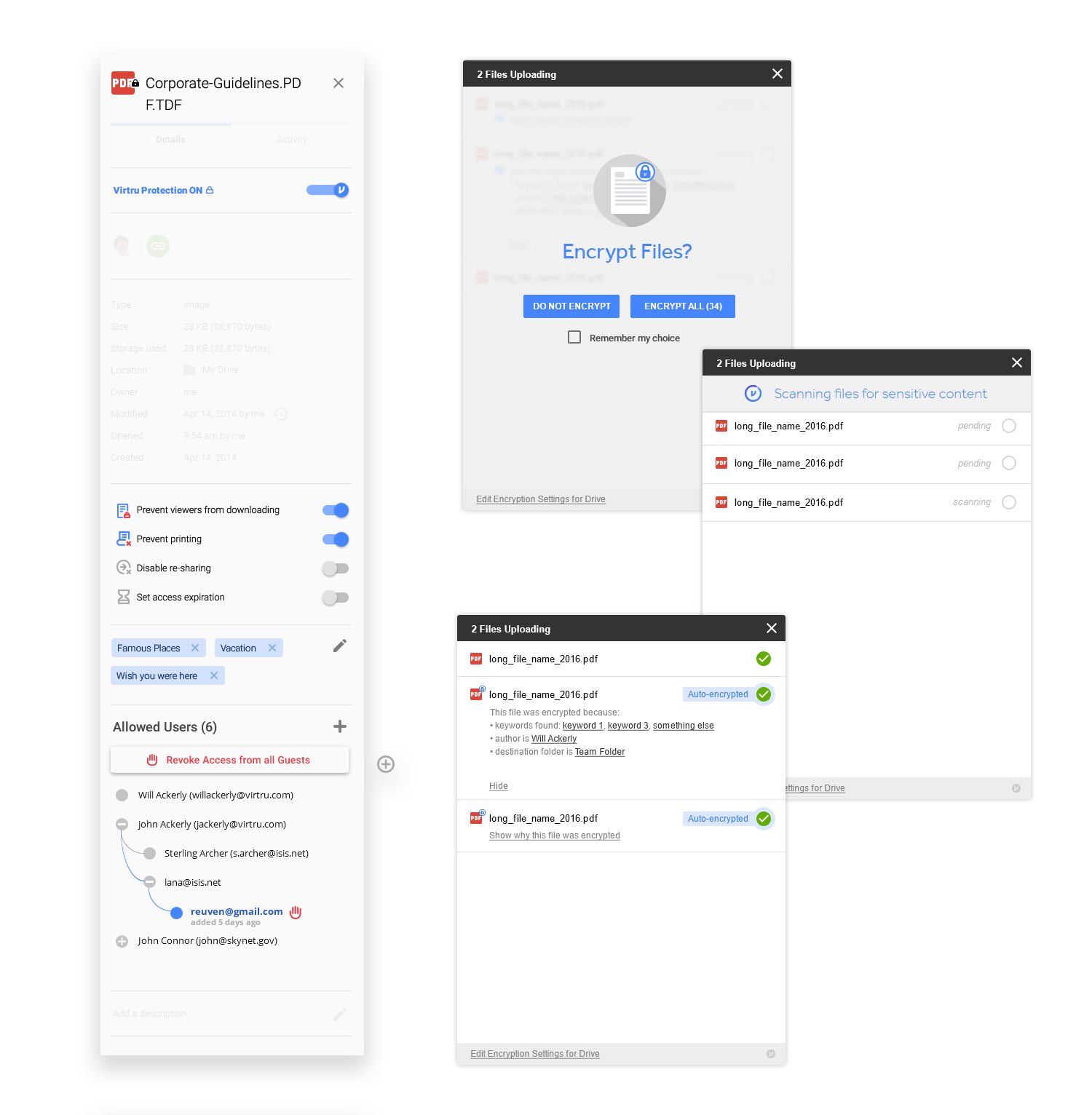
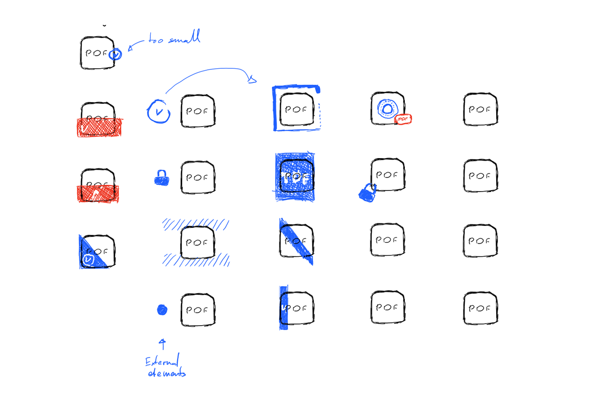
I also worked out some obvious design issues, such as how to distinguish a secured file from a regular one.
Going high fidelity
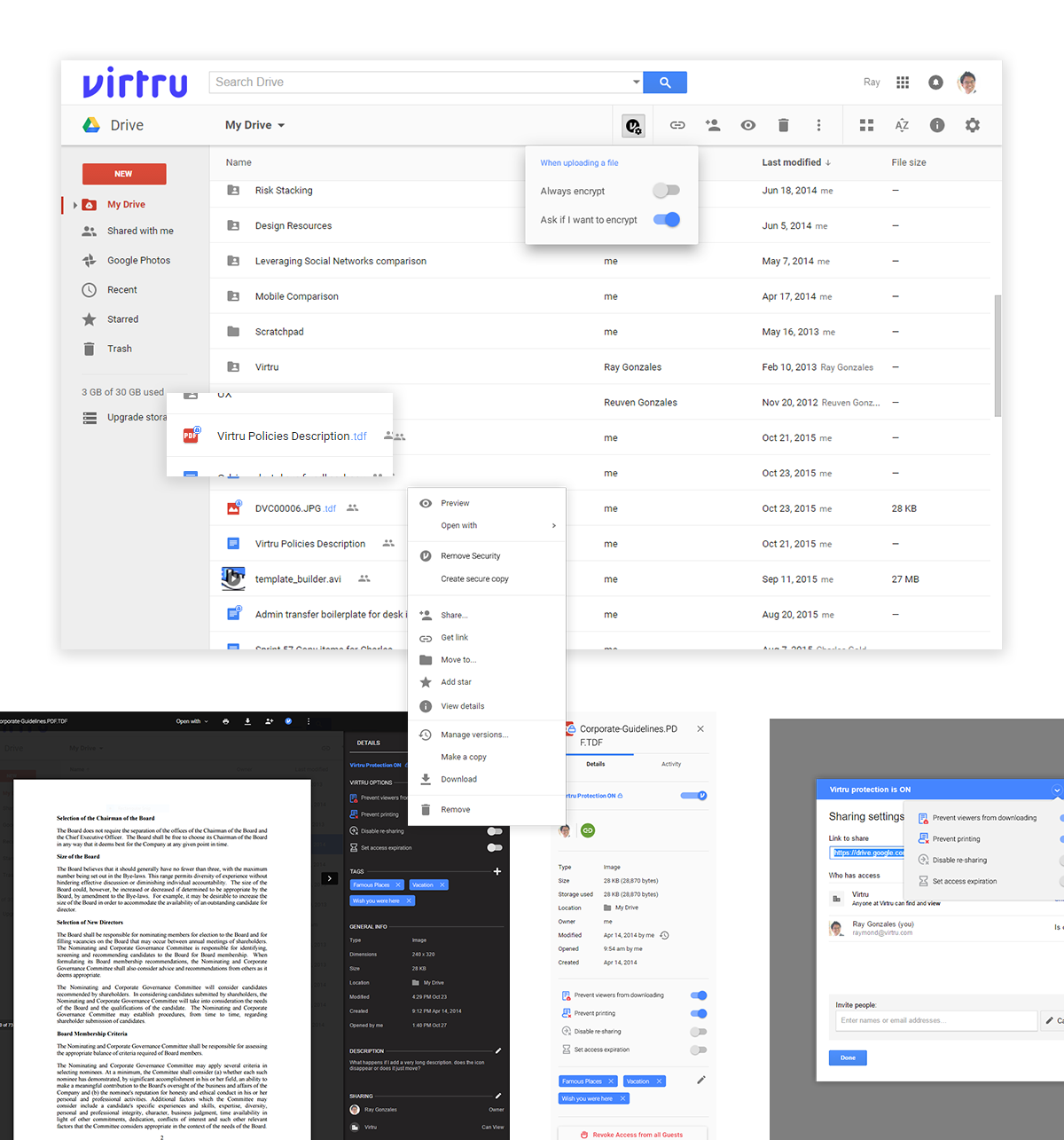
You can only work out so many details with lo-fi sketches. Once I reached a point where core experiences were essentially blocked out, I moved on to higher fidelity mockups to get into the details. With higher fidelity, feedback and comments tend to be more “complete.” Furthermore, user testing results also increase in quality.
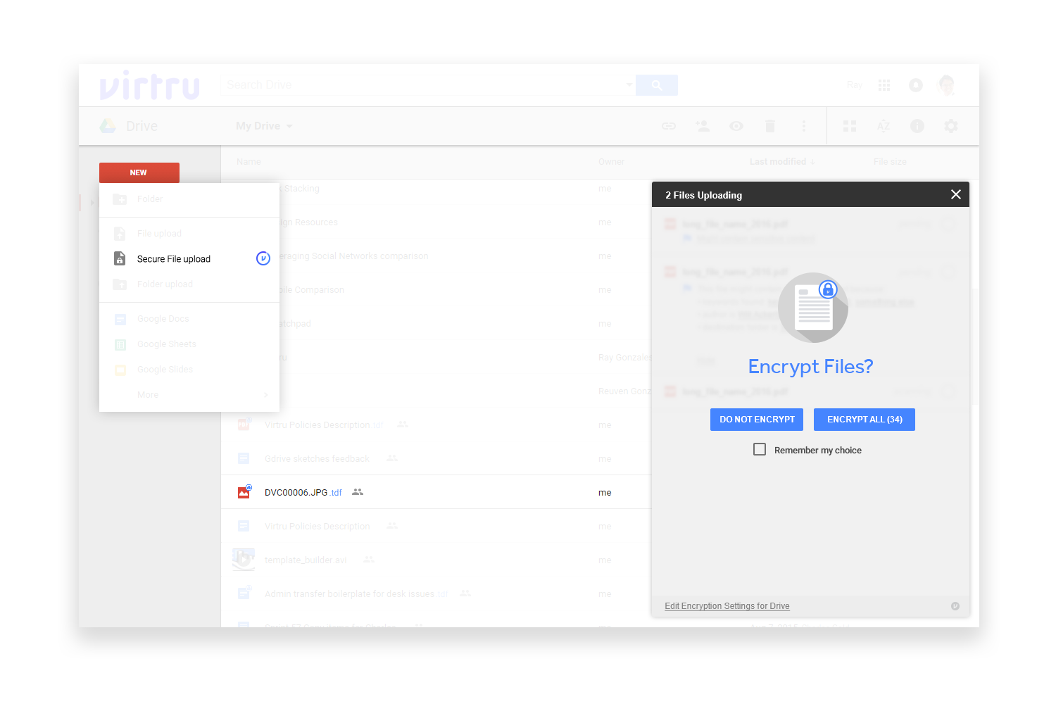
One of the interactions we worked out at higher fidelity was the drag and drop interaction (click to view). When adding a file to drive, if it met certain criteria, it needed to present the user the option to encrypt it or upload it normal.
Validating Assumptions
As with any project, we made a few assumptions about user goals and user behaviors. Furthermore, there were differing opinions about how best to approach the user experience.
For this project, our assumptions/differing opinions were:
- Creating a duplicate, but secure file vs a encrypting a file in place
- Users would know to go to the details pane to make adjustments to security parameters
- Downloading a wrapped file vs only allowing decrypt then download.
To validate, we set up a moderated user test. For this test, users would complete a few basic tasks generally around managing and sharing files in different contexts. To simulate the experience, we created several click through prototypes using Invision. The various prototypes addressed key aspects of our assumptions/differing opinions.
Our users for this test were current and prospective clients who expressed interest in a Virtru solution for sharing files securely and matched our intended audience.
The results of this test brought greater consensus on our direction, gave us insight into a better user experience, sparked a few creative solutions, and even caused us to change the priority of certain elements.
Where do we go now?
Through constant collaboration with key stakeholders, the user experience for Virtru’s Drive integration came out simple, useable, and generally in line with user expectations. A nice first step in creating a way for users to feel confident about their files living on the cloud, using a familiar product they love.
The next (of many) steps from here are to continue monitoring and validating what we are building through metrics, feedback, and revenue.