For Encrypted Emails, the Recipient UX is Key.
The recipient UX went through many iterations throughout my tenure at Virtru. I learned a lot of valuable lessons through those iterations. Here are a few of the major iterations, how I approached them, and what I learned.
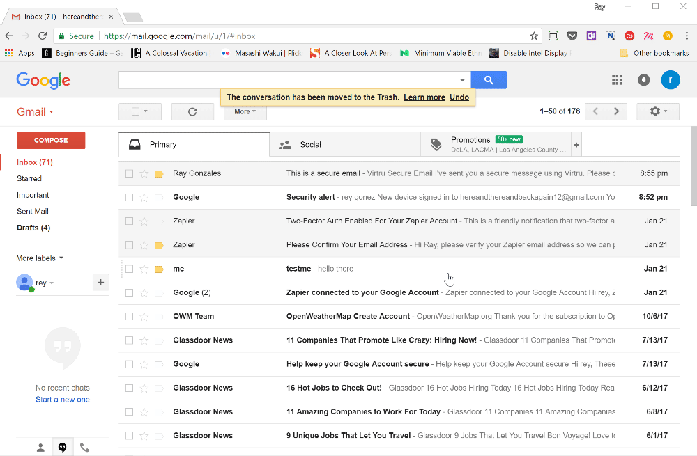
Iteration 1: Reading in the inbox
The goal of our first iteration was to make the install and setup process as easy as possible. This goal was based on the difficulty of setting up and using PGP, the long-time standard for email encryption. PGP has been around since the late 90’s, yet its relatively unknown. Our theory was that if you could make this easier, more folks would use it.
Naively, we made our initial target audience Everyone. At the time, we had recently entered a post-Snowden world. Everyone we had spoken to was very excited about the prospect of an easy to use encryption service. Furthermore, we believed that it was everyone’s right to communicate privately in whatever medium they chose. We wanted to bring about societal change where everyone was able to do just that. Hence, our target audience = everyone.
My first task was to smooth out the already built workflow. I set off to simplify certain processes and make information more consumable.

I put this in front of users at various points for feedback. The results were very interesting. On one hand, we did make it very easy for users to install and setup. Everything was just a simple click that users responded very well to. On the other hand, we found that most recipients did not want to install anything, no matter how easy/quick it was. So, while we succeeded in meeting our initial goal, we did not quite meet the recipient’s needs.
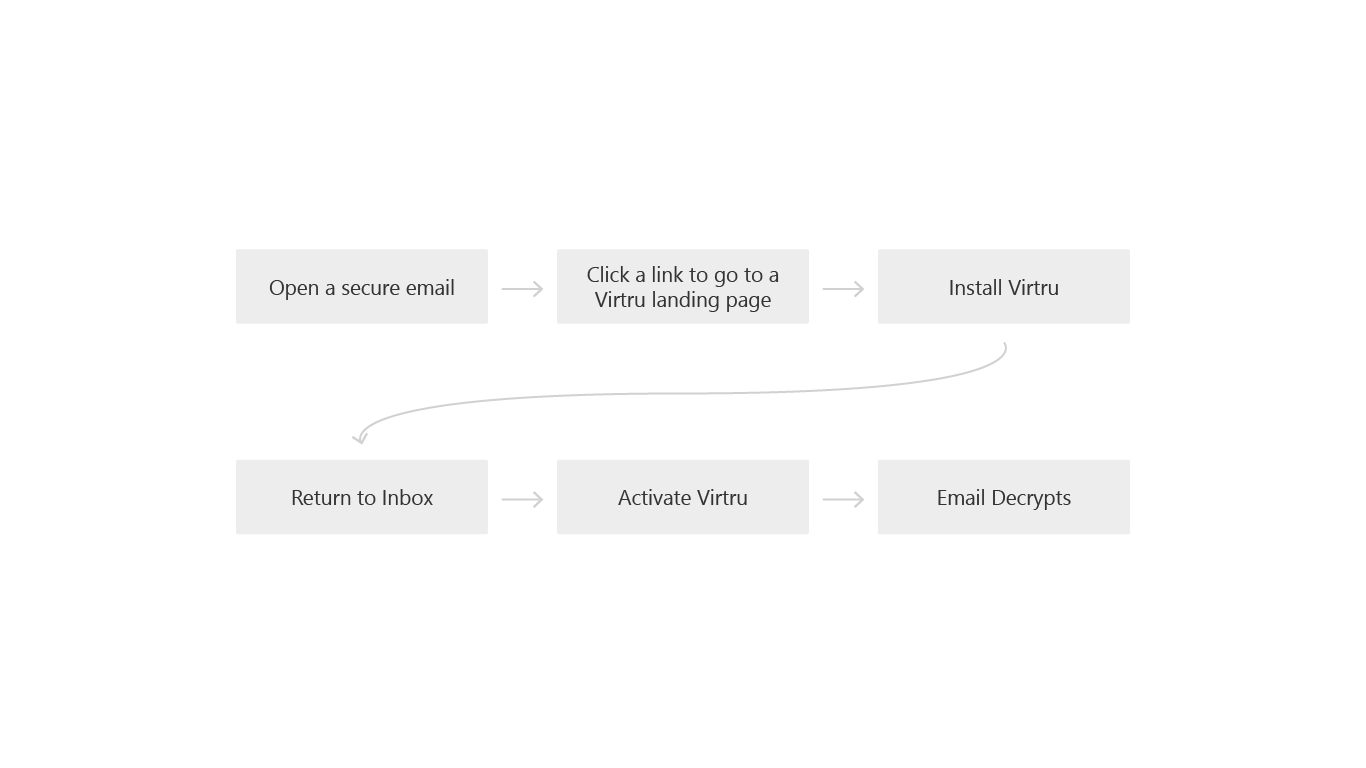
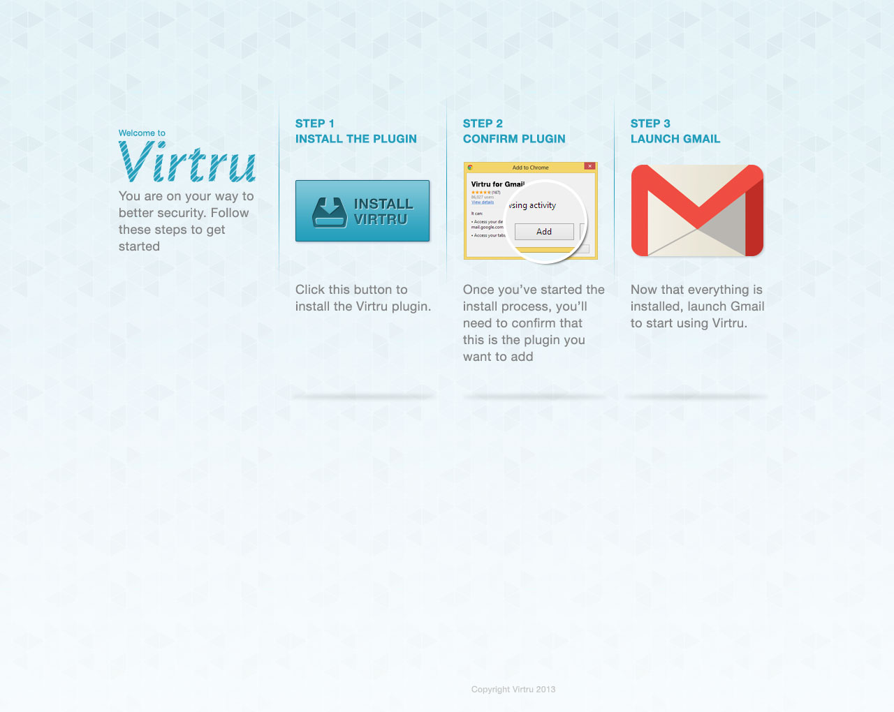
Iteration 2: Reading in a web portal
Our next iteration had to allow the recipient to consume a secure message without installing Virtru. With our small team, we brainstormed/sketched potential solutions but had to contend with significant technical limitations and privacy concerns.
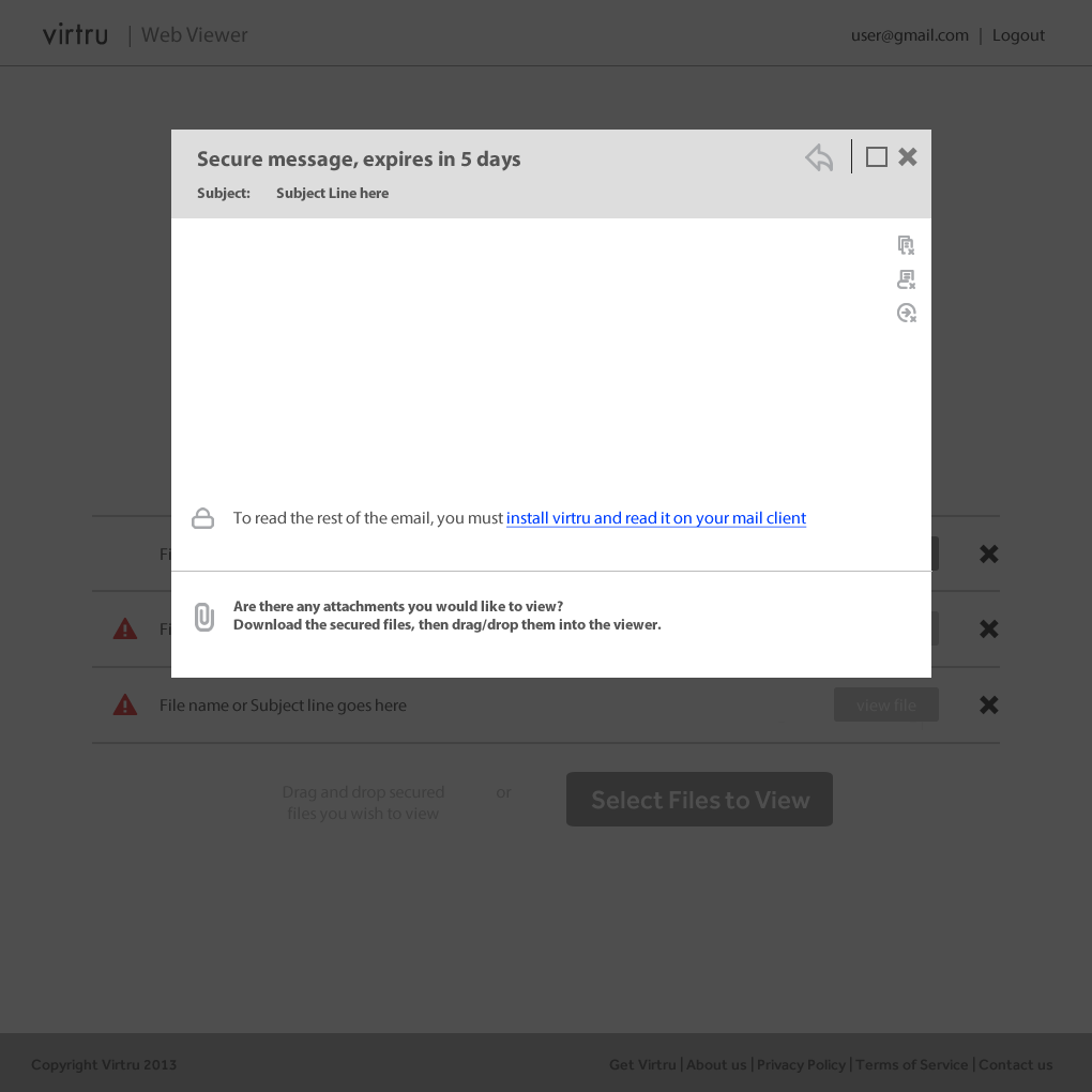
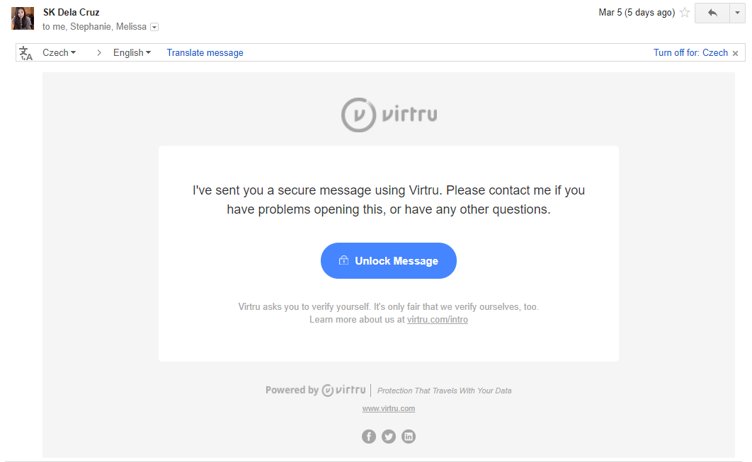
Ultimately, we settled on a secure web portal that allowed recipients to consume a secure message without having to install anything.
But, it did come with two significant issues that could hinder the recipient experience. These issues were an unavoidable by product of our technical limitations at the time and the privacy tenants we needed to preserve. The first issue was creating an account. Would a recipient, who did not elect to use Virtru, sign up for an account to use Virtru? The second issue involved the proposed encrypted attachment. Basically, in order to decrypt the secure message, each secure email would have an attachment that was a copy of the encrypted content. The recipient would then need to download that attachment THEN upload it back into the secure web portal, where it would be decrypted. Would users get lost in this process?
To assess these concerns, we created small prototypes at various fidelity (from simple click throughs to functional components) and put it in front of users.
The results were disappointing. Most recipients didn’t care to create an account. Furthermore, the attachment idea had too many steps where many users simply got lost or thought they downloaded a virus. But one interesting result was that context of the sender greatly impacted the recipients motivation to read a secure email. An email in a professional context generally saw more effort to read its content than an email in a personal context.
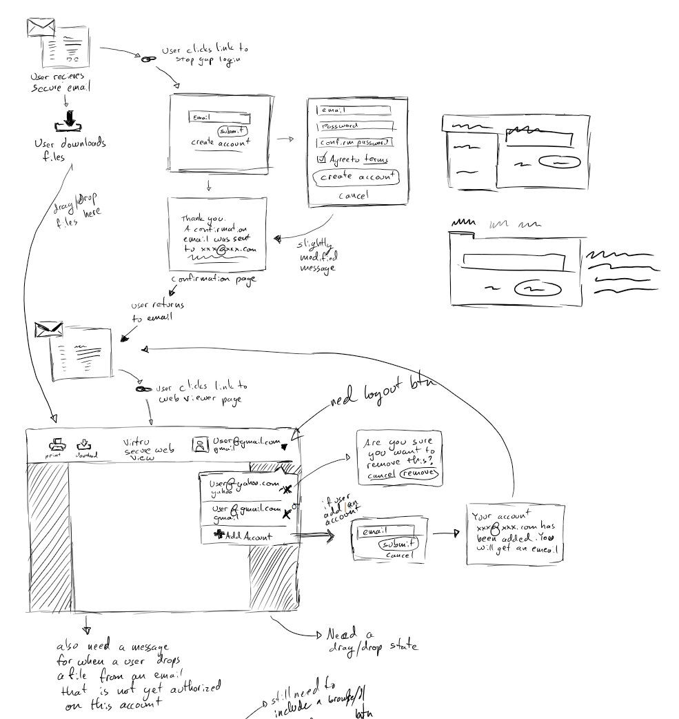
Iteration 2.5: Improving the web portal
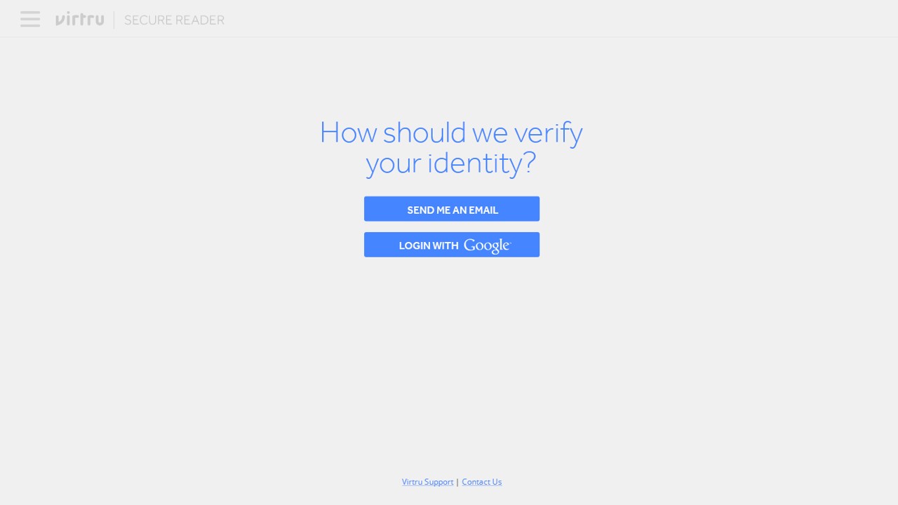
From the lessons learned in iteration 2, our next solution had to do a few things: 1) verify the identify of recipients without requiring an account creation 2) automatically load the secure content to the web portal without compromising security and privacy.
Luckily, the engineering team had figured out a technical solution that allowed us to solve both of these issues.
Once again, we set to validate our assumptions through a variety of lo-fi prototypes to working components put in front of users. At this point, our users were also much more targeted to individuals in professional settings within regulated industries.
The results were a vast improvement from the last major iteration. Recipients had a significantly higher success rate in consuming a secure email. Furthermore, this iteration allowed Virtru to become a viable solution for many organizations, creating a path to grow from 5 guys in a basement, to 80 people with an office in DC.
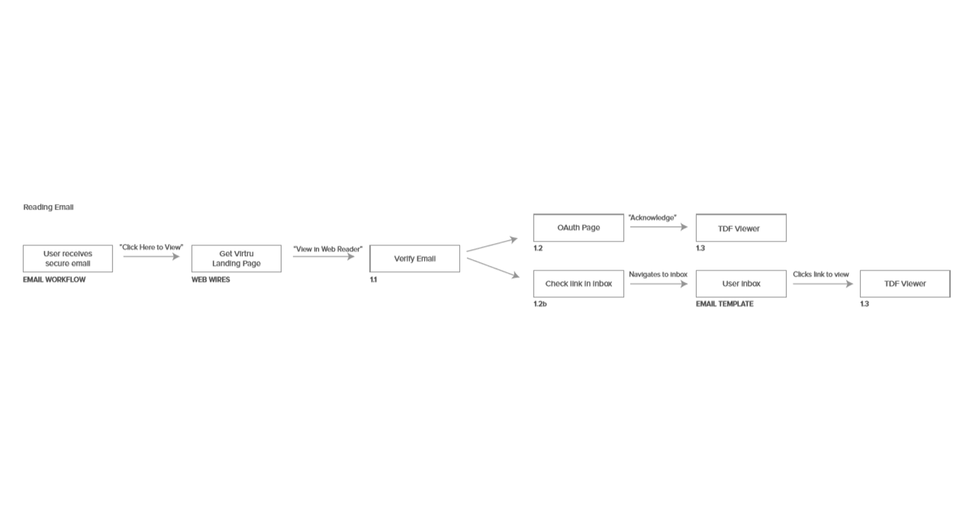
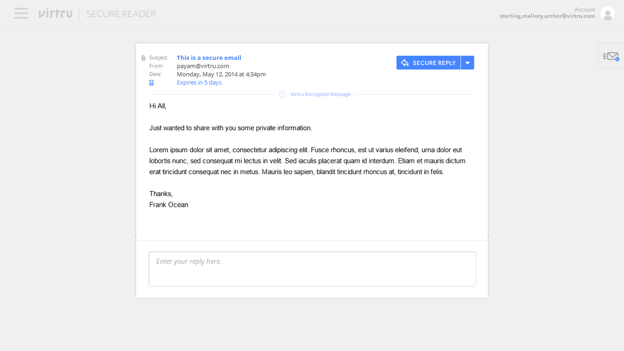
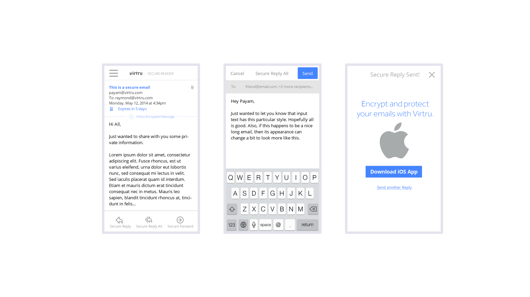
Through various iterations, we continued to make improvements. The latest experience looks like this:
Lessons Learned
The recipient experience is still an ongoing project today, with a variety of potential solutions to explore based on a variety of qualitative data we gathered through user tests, interviews, observations, and quantitative data.
For me, it was one of my first real product design experiences and I learned a lot through the years making iterative improvements.
A few of the more major lessons I learned were:
- Setting clear success metrics, even educated guesses, helps to gather alignment and direction
- Qualitative data should be validated with quantitative data
- Aligning UX goals with other business units produces better results faster
- Designing for Everyone is designing for no one
- Know what you are looking to achieve, validate that the users you’ve selected are the right audience, and test at the lowest fidelity possible that would produce the quickest most impactful results