Virtru - Making Encryption Easy
Virtru is an encryption software company, specializing in encrypted email communication.
I worked at Virtru for about 5 years. During that time, I was the sole product designer for the frist 4.5 years, handling designs for about 10 different platforms, 15 engineers, and anything else anyone on the team needed. I would do everything from user research, to UX work, UI/ Visual design, and sometimes front-end development.
How do you make encryption/security easy?
If you’ve ever tried “traditional” email encryption software, such as pgp, you know just how difficult it is to send or receive an email. Its been around since 1991, yet its not widely adopted. Both sender and receiver need a high level of technical ability to even use it. To be a viable solution in the marketplace, Virtru had to be easy enough for non-technical folks to understand.
This was always the key question for Virtru. The solution, is an ongoing effort, but generally consists of 3 parts.
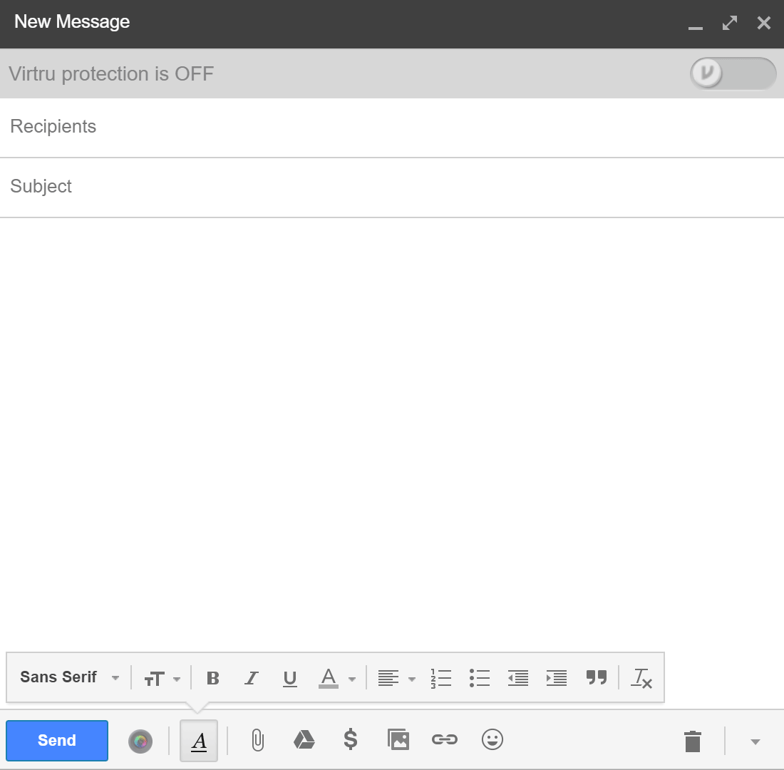
Just turn it on!

Switches are an interaction pattern that everyone encounters on a daily basis. It represents a change in a status. For example, a dark room, can become a bright room with a flip of a switch.
Virtru takes advantage of this existing pattern for its email encryption service. The switch signifies a status change from normal to encrypted. Virtru’s switch is probably its most recognized asset, but getting to this point took a few rounds of iteration and feedback.
While PGP required users to exchange encryption keys and go through a lengthy setup, Virtru has always sought to abstract the technically difficult part, so that the only thing users needed to worry about was if they wanted a message encrypted or not.
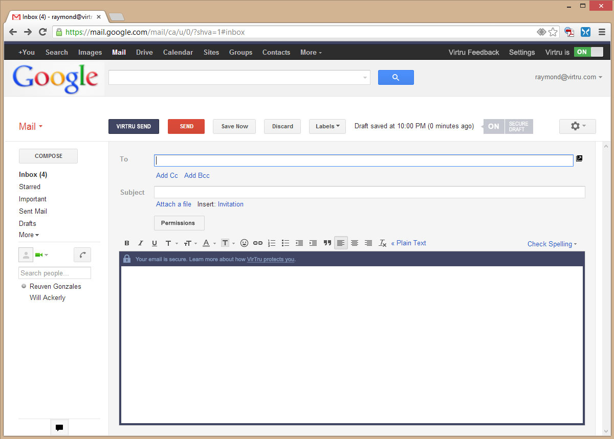
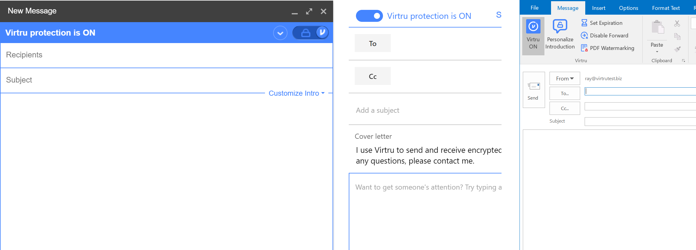
Initially, we experimented with a dual send button paradigm and a switch along the top of the window. After some prototyping and feedback, we discovered that this presented a few issues:
- With two send action buttons of equal importance, users could easily confuse one for the other.
- At the point of hitting send, users were not usually thinking about encrypting a message, but rather simply getting the message sent
- Users assumed that ALL the content was encrypted whenever they hit the switch.
To solve the problem, we knew we had to narrow the visual scope of what the switch affected. At the same time, Gmail also changed the UI of composing new messages to be contained within a modal that sat above all content. Thus, the solution was to place the switchin within that modal. This proved to be very successful.
Work within an external system
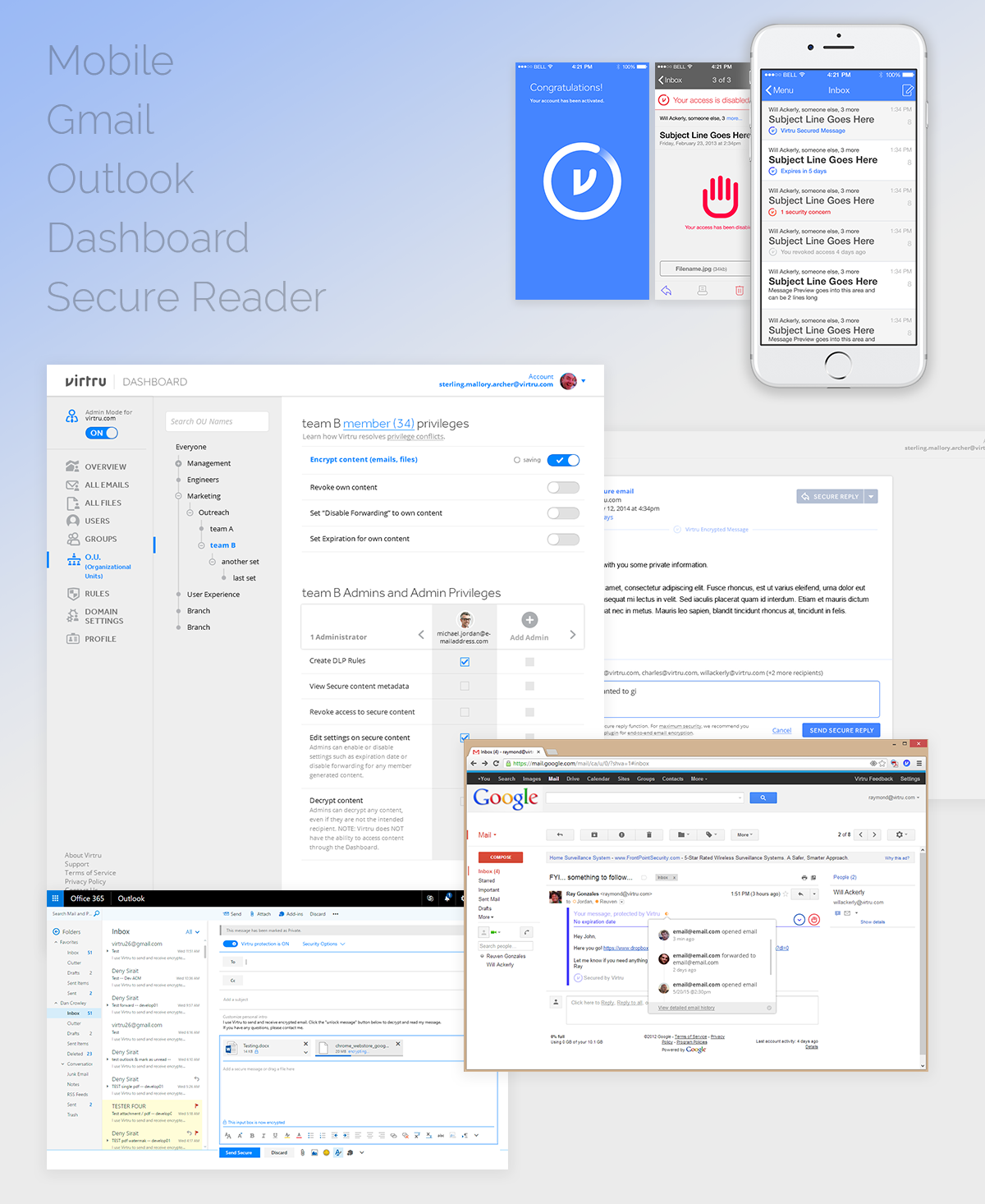
As Virtru expanded into other services, it became very clear that the exact same solution could not work universally.
The idea of a switch could be shared between services, but how that switch looked and behaved had to fit the expectations of the users on that service.
This applied to everything beyond the switch as well. Users loved and were used to how their favorite email clients looked and behaved. To introduce elements that did not fit that design language made users feel uneasy, called too much attention to Virtru, and generally made things disruptive and a poor user experience. With encryption already being a scary subject, the additional detriments made Virtru harder to use.
Therefore, the solution was to add features and functions into various services by closely integrating with the existing design language. This involved a lot of research as well as close collaboration with the development team to work around limitations, but still make sense to users of that email service.
Recognizeable between systems
While Virtru did follow the design language of the service it was integrating with, it was also important to have an underlying system that was recognizeable across email services. This allowed users the freedom to switch between email services without having to relearn Virtru, but also use Virtru’s non-integrated services, such as the Dashboard. It also served as a vehicle to help Virtru brand itself where appropriate.
This underlying system was mostly on the development side, but on the UX side, it did manifest itself through the use of similar icons, the same type of copy, and other ancillary elements (such as transactional emails) that allows users to acclimate to Virtru as a brand.
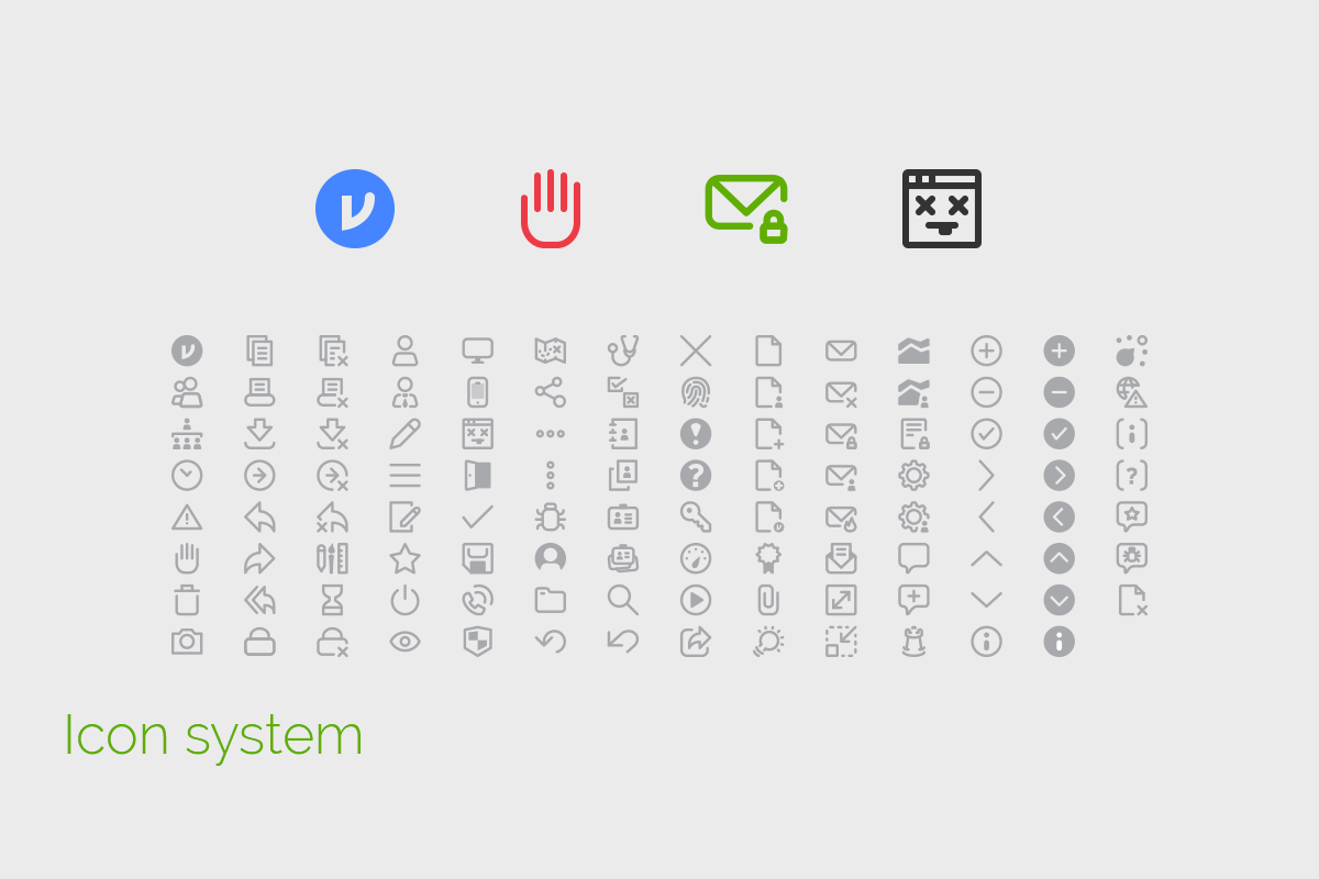
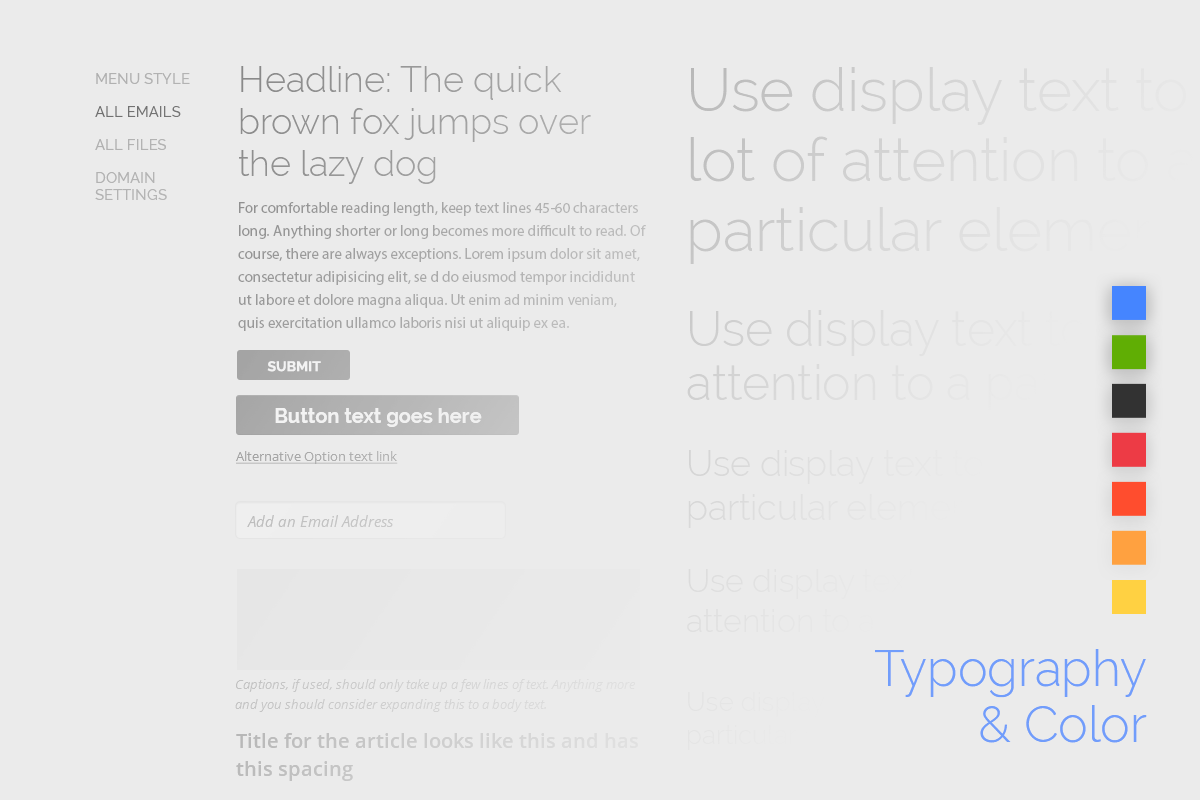
Additional images about Virtru’s system
Virtru’s approach to UX is constantly evolving, but so far this has allowed Virtru make UX its key differentiator among its peers.
Here are a few more images that sample Virtru’s Design system.