ToBetterUs - Attempted Philanthropy Online
Lots of goodwill, little money
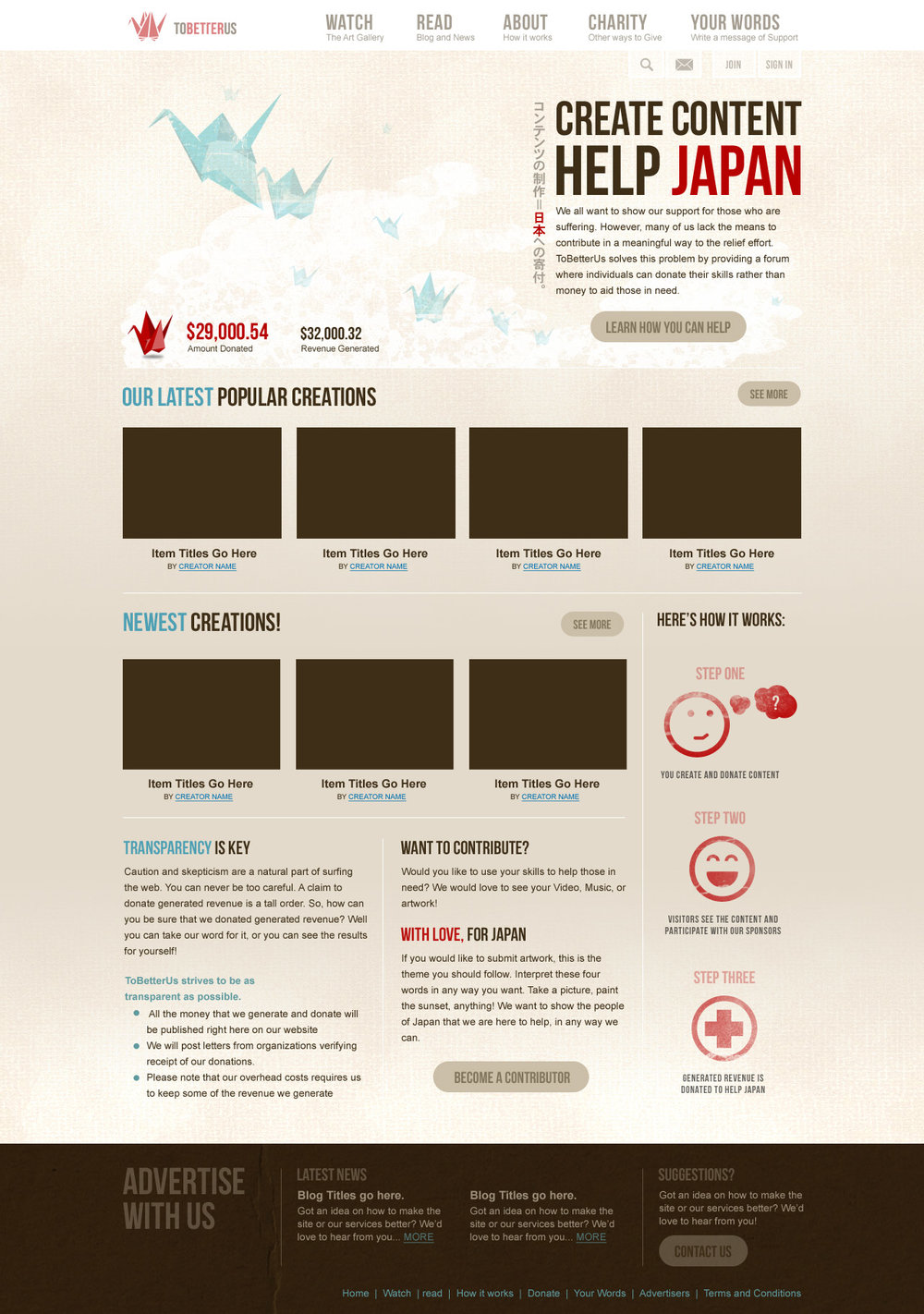
My brother and I have many personal connections to Japan. Shortly after the great Japan earthquake of March 2011 that caused the subsequent devastating tsunami and nuclear plant disaster, my brother and I felt strongly compelled to help. We both donated what small amount we could afford, but we wanted to do something more, something meaningful.
Short on cash but high on energy, we were thinking about how can we can use our skills to help and leverage the internet to do something meaningful. Thus, ToBetterUs was born.
ToBetter.us (TBU)
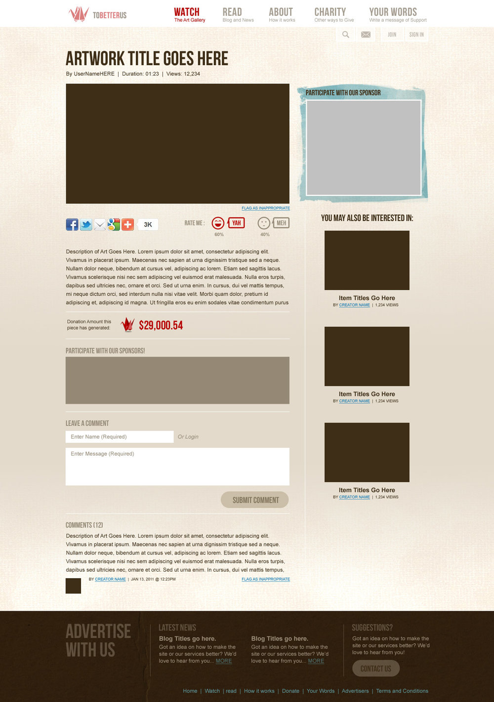
The idea behind TBU was to leverage the power of creative individuals and their followers to generate ad revenue. Then, that revenue could be donated to a cause, particularly those devastated by the Japan earthquake. From a user’s experience, she would upload a video, artwork, or something creative to TBU. From there, she would tell her friends to visit TBU and check out her work. Not only would she be helping to spread awareness for a cause, but also those friends would generate ad-revenue through impressions, which would then be donated.
We were thinking about how others like us, who didn’t have money to spare but wanted to help, could contribute. In this way, you could leverage things you might have more of (time, creativity, and social capital) and convert it into real money for a cause. So, we put on our thinking caps and started planning how we would save the world.
Planning
While my brother took up the engineering effort, I tackled General UX, Marketing/Sales, Project Management.
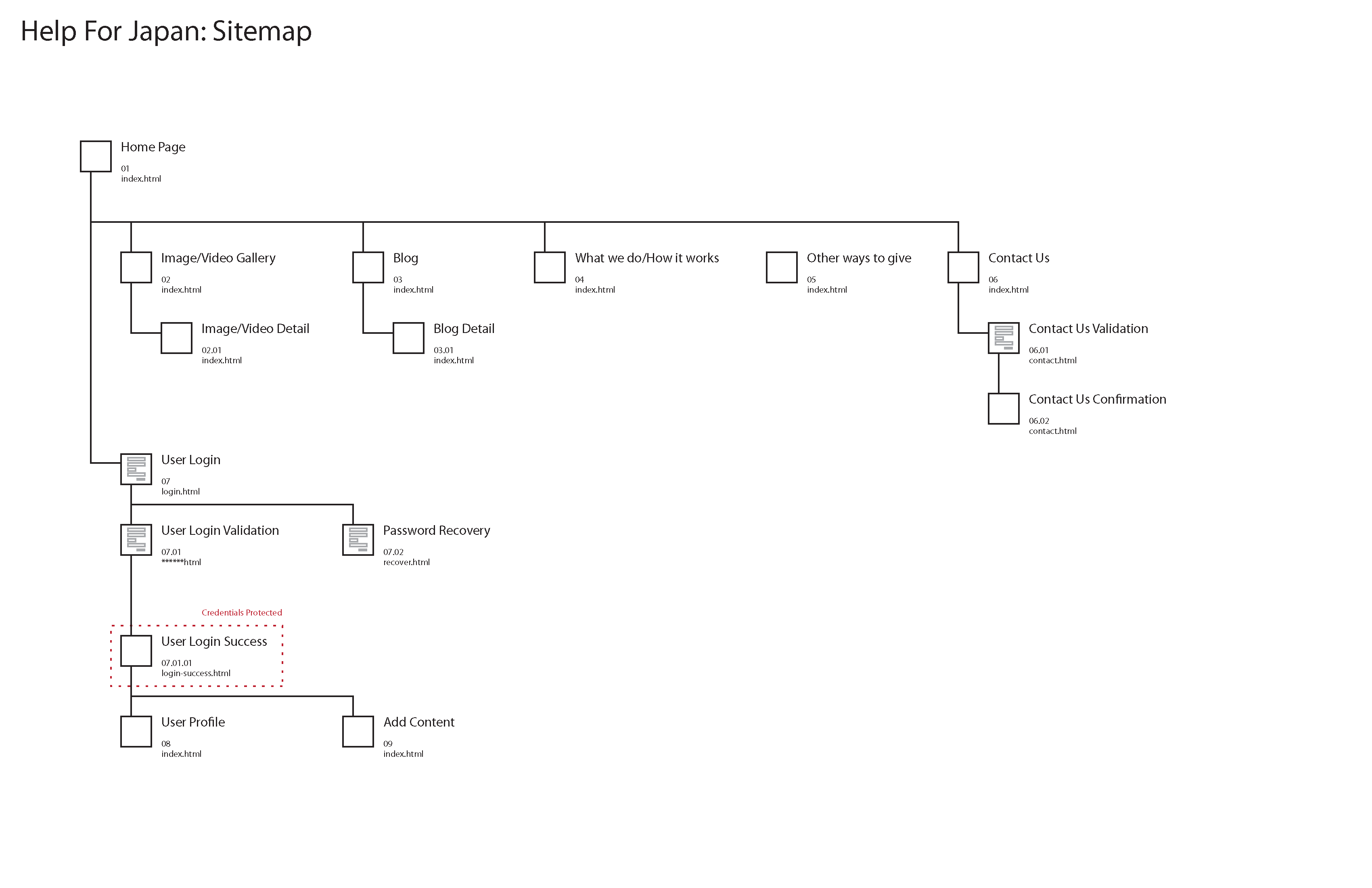
Our initial plan included basic informational pages as well as art browsing/viewing screens with a variety of functionality. We planned to allow for comments, portfolio management, and leverage a creator’s social media network to bring in traffic.

Appealing to an audience
For a service like this, we determined that the most important element was to establish trust. No one would give us the time of day if we couldn’t prove that we were actually converting your goodwill into donated money. So from the start, we strived to be as transparent as possible and designed it to be part of the service in the form of a revenue banner.
The revenue banner would appear in several places: the home page, the detail page for the art you upload, and your own account page. It would detail how much ad-revenue was generated and where the money went. Depending on where a visitor was looking, the scope of the revenue banner would change from very general to very specific to the artwork. We even had plans to have a “results” page that would show the impact over everyone’s work, but never got around to it.
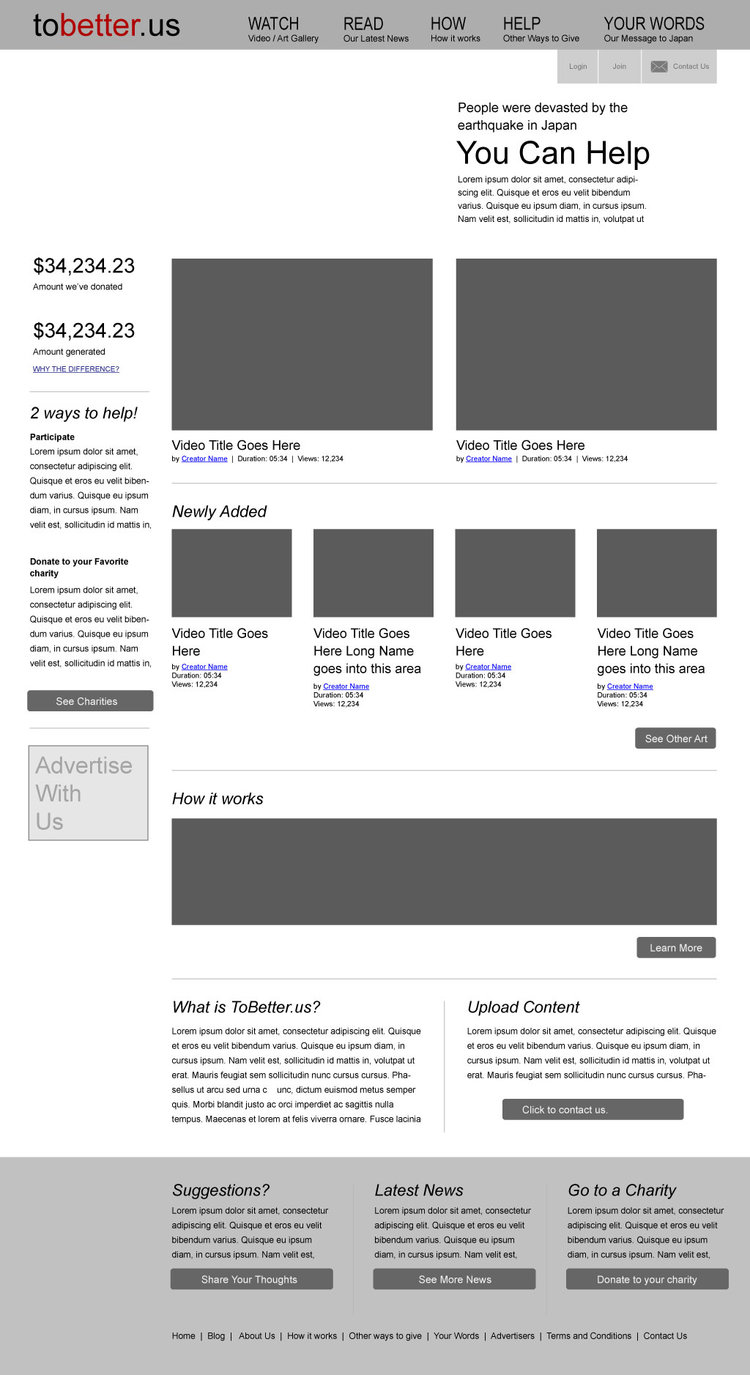
We sketched out multiple ideas, shot some down, picked up new ideas, created a general flow and wireframes, and eventually designed the core experiences.
The next step from there was to bring in traffic. So we reached out to creative individuals we knew. To our delight, most people agreed! We even started reaching out to non-profit organizations and posting small flyers wherever we could.
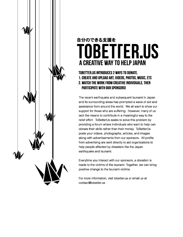
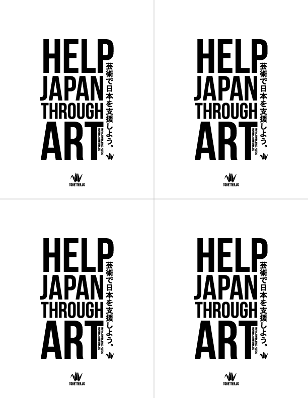
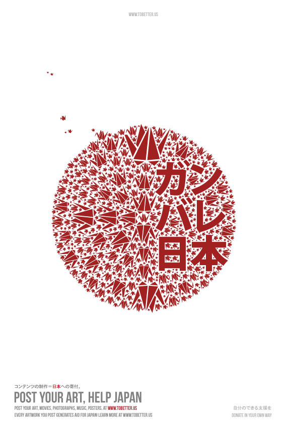
We got really excited when we discovered that a complete stranger on the other side of the world posted a video for us to help us advertise. This completely blew our minds and gave us a surge of energy to keep working.
With this project, we were way beyond our comfort zone and expertise. So, we started looking for help and recruited individuals who had experience in areas we lacked, particularly in marketing, starting a business and potential funding.
Falling apart
Despite our best efforts, 4 months later, things started to fall apart and eventually lead to TBU’s demise.
The first major downfall was when the people we brought on to help politely left the project. This could probably be attributed to our naïve business acumen (or complete lack thereof).
Another crack in the TBU effort came from several non-profits who expressed interest. but would not commit to contributing anything. Among other things, this can probably be attributed to the lack of evidence of TBU’s capabilities.
The straw through broke the camel’s back was the increasing scarcity of our time. For both my brother and I, work responsibilities increased which eventually made the time we could contribute to TBU nonexistant.
Lessons learned
TBU was an ambitious project and a quiet failure. Although we felt terrible at the time, in hindsight, it was a great experience that taught us a lot of lessons. Here are a few of the key lessons we learned.
LESSON 1: Validate early, validate often
We operated on goodwill and take-out food. We sold dreams, but we had no data that would even hint that those dreams could become reality. Had we had data, it could have informed the direction we were moving, the people we were talking to, or even if this was worth pursuing.
For example, we could have validated our value proposition by creating a sign-up page that would explain TBU and collect information from interested participants. This would have given us valuable insight (such as, are creators philanthropic enough to make free artwork? Or would we need to change the incentive?) as well as a pool of users we could tap into for user testing, surveys, etc.
This could have also given us the evidence we needed to bring more creators involved. Or at the very least, indicated how we can find evidence/motivation for this.
LESSON 2: Build just enough
My brother was the sole engineer working on TBU. We had grandiose plans to build all of these wonderful systems and started working on all of them. But because of this, we ended up squandering our limited time on none critical items, which ultimately meant that we could not move forward when time became an issue.
LESSON 3: Wear all the hats
This lesson can be broadly applied to many aspects. You must be flexible with your role and wear many many hats. You must be flexible in plans because things can change quickly.
LESSON 4: Prioritize and Focus
Our time was split constantly between the work that paid and TBU. What we should have done was make TBU a smaller project, or dedicate more time to TBU. Instead, we were working harder, and not smarter.
LESSON 5: Know when to quit
TBU probably survived longer than it should have. We were both so passionate about it that we ignored all the signs that it died. So, we stressed, got sick, soured relationship, and continued to carry the flag for TBU even though it was clearly dead.
I do not regret taking on TBU at all. In fact, I am happy we did it. It taught me a lot about myself, running projects, the value of time/money, and many minor lessons that I went on to apply to future projects.