Send and Read Secure Emails from Office 365's Web Email Client
As Virtru expanded further into the B2B space with enterprises, integration into the Microsoft ecosystem became a necessity. Not only would it allow Virtru to expand into a new and larger market, but it also provided a safety net in the form of diversification.
The integration task involved porting all of our features from Gmail to Microsoft’s ecosystem, starting with:
- Encrypt a new email
- Managing an encrypted email
- Reading and responding to encrypted emails
- Activation and Onboarding
Discovery
Once the decision was made to move forward with the integration, we started the project with a general goal of porting all the same functionality from our other products. To better clarify the direction we were moving, I brought a series of questions to our kickoff, with the most important being:
- Who were we targeting and why would they use this over competing products?
- Are the end-users materially different from users on our Gmail product?
- Constraints?
- Success Criteria?
Working with various stakeholders on the team, I was able to collect answers. Some answers were collected through customer development, other answers had to be derived from additional user interviews that I planned and conducted.
Multiple solutions
Considering all the constraints and goals, we eventually centered on two potential solutions: 1) Integration with the Microsoft Office store or 2) Creating our own separate web extension.
The Office store integration was a very appealing solution because it offered us wide reach with a potentially low development cost ( integration into all Mobile apps, desktop apps, and websites). The potential risks were unknown limitations and level of effort. We had no idea what exactly we could control, what this meant for the user experience, and if we would actually save on the development effort.
The web extension solution was much more familiar. We generally knew the development cost, based on past experience, and we had absolute control of the UI. The risks and limitations were unknown technical limitations as well as integration only with Outlook web app on a single browser.
From my perspective, the Office store integration seemed like a silver bullet. It provided us with familiar interaction patterns that we could leverage without much effort as well as a potentially lower maintenance cost with greater reach. Past experience has taught me that a high maintenance cost can detrimentally affect a user’s experience. So, I was very much in favor of exploring this solution.
The rest of the team came to similar conclusions and we started work to de-risk this solution. This was done through research, experiments, and user tests of key experiences.
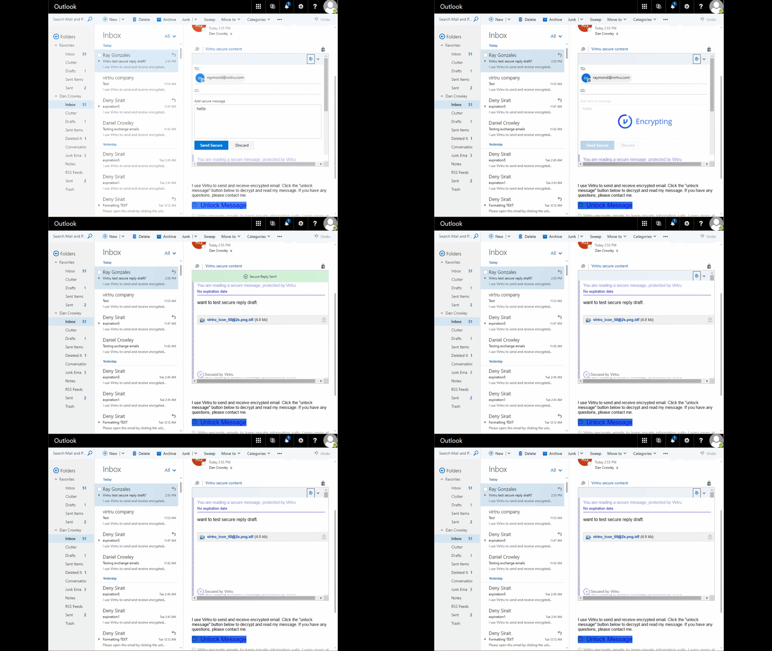
The results of our work revealed that the store integration was not a viable solution. What we were able to control was much too limited, resulting in an awkward user experience. To help the user through this awkward experience would require significant training, which defeated our core value proposition: ease-of-use. We abandoned this solution and moved into the next option: a web extension.
The one solution (…to rule them all?)
Or at least the best solution that would help us meet our goals.
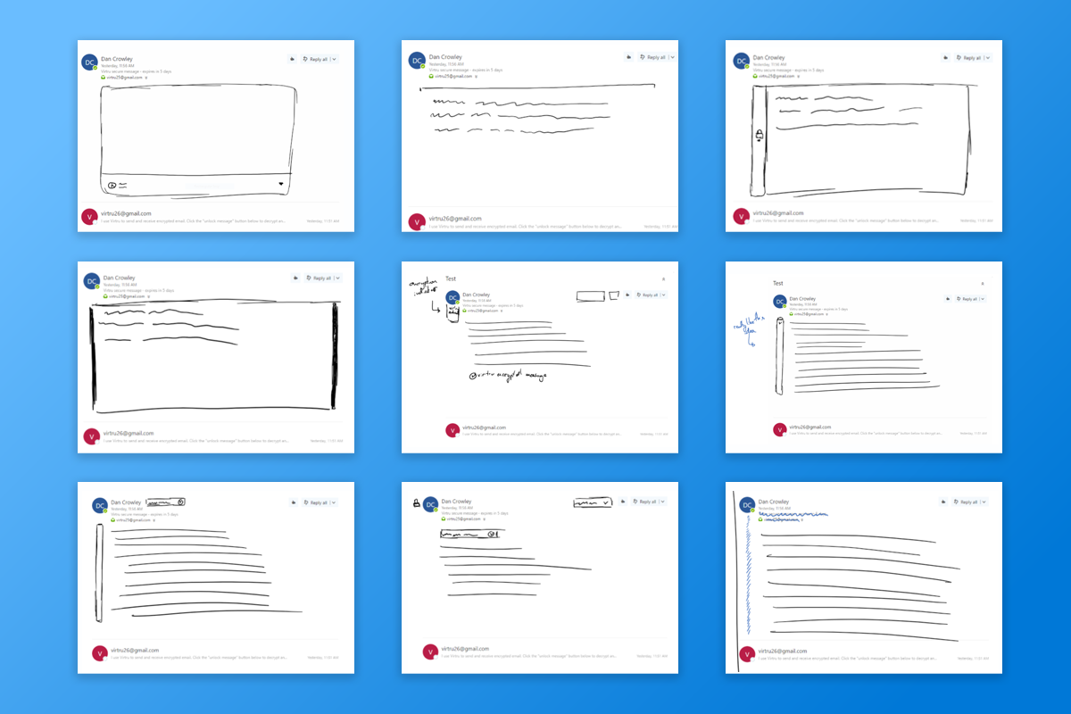
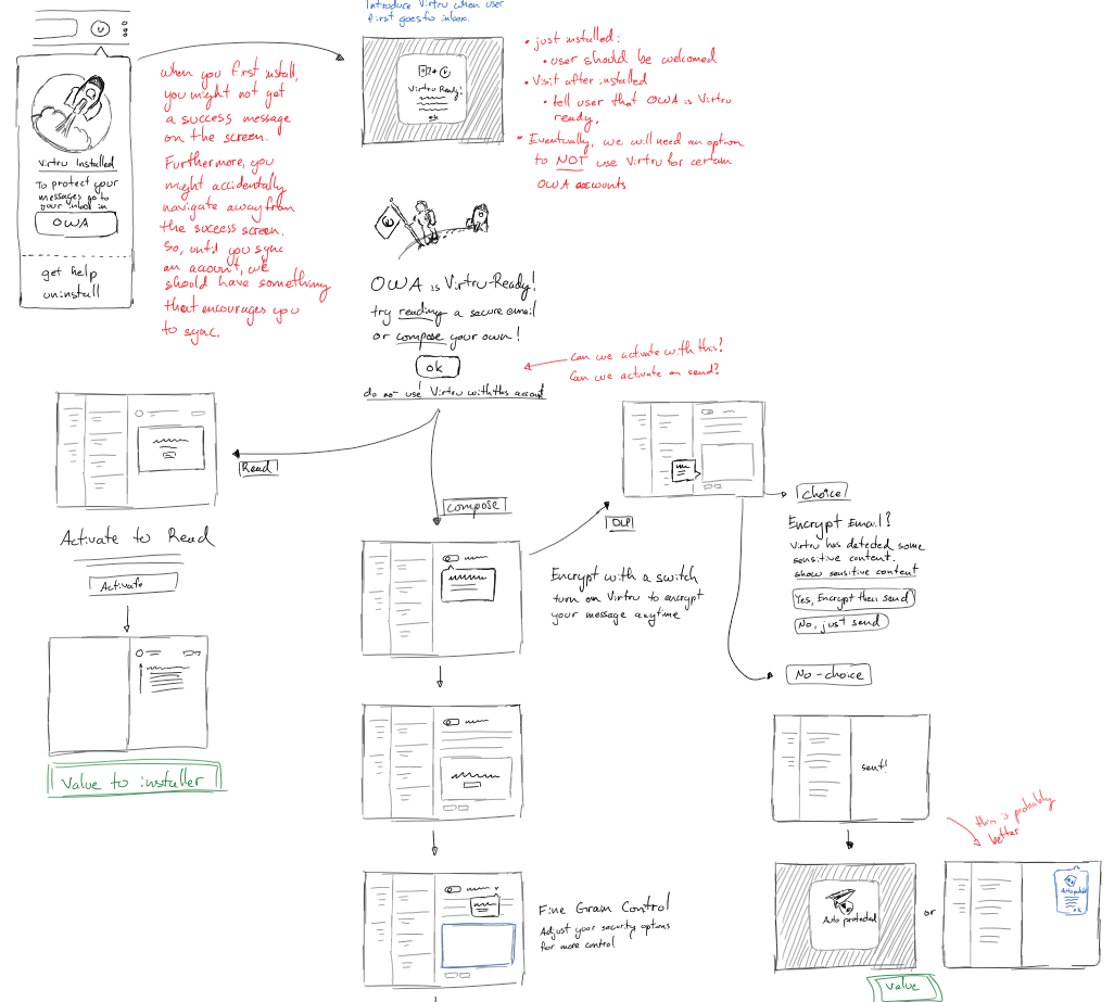
While we abandoned the initial solution, we learned a lot. So, we didn’t have to redo everything from scratch, but we still needed to work out what the key experiences looked/felt like. With our stakeholders, we started by sketching and brainstorming potential experiences. Expanding on those brainstorming session, I wanted to make sure we wholistically considered the entire experience, so I would create quick maps to help us understand how everything fit together.
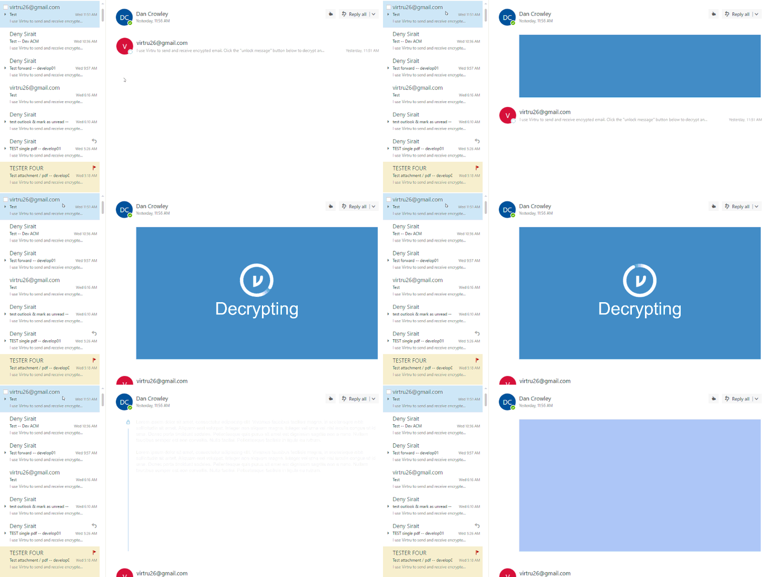
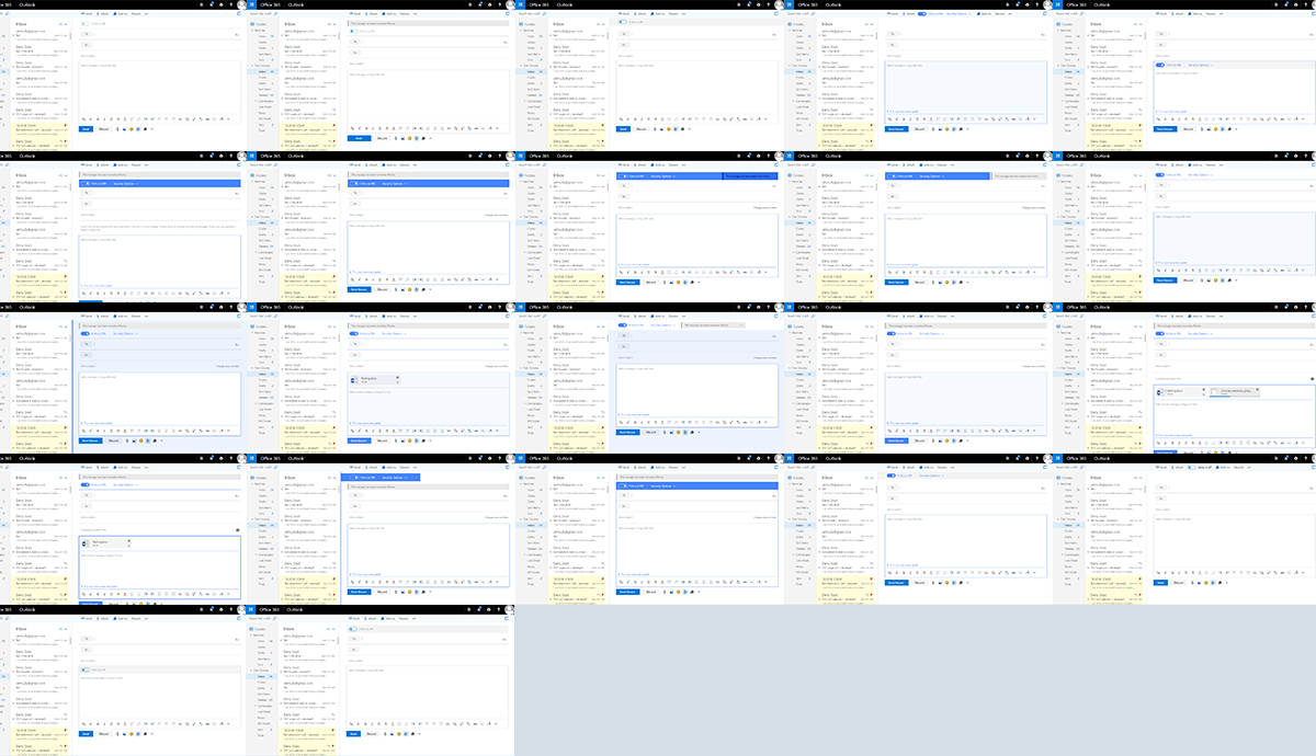
Once we were confident enough about the experience we created, I made a variety of high fidelity prototypes, ranging from simple click-throughs to animated videos to better understand the experience. In addition, I put these in front of our customers to get feedback. This allowed us to iteratively make improvements and course correct. (Yup, I skipped over low-fidelity prototypes as Microsoft’s design language provided us with enough material to go straight into high fidelity to get higher quality feedback.)
Results
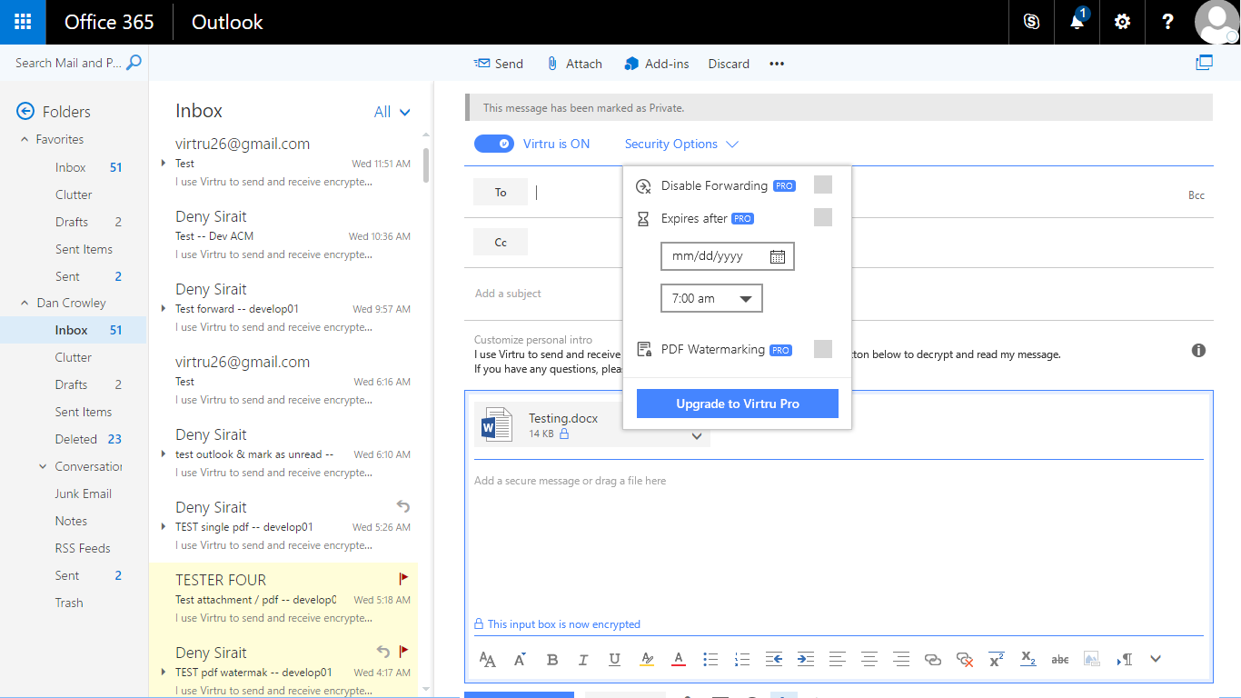
Working with our customers, we were able to build a product that met their business requirements and made it easy for their employees to use. Furthermore, we were able to expand Virtru into the Microsoft ecosystem, providing a larger set of potential customers. At the time of this writing, the web extension had not been widely rolled out. So, our qualitative results have yet to be validated through quantitative data, but I am confident it will be generally positive.
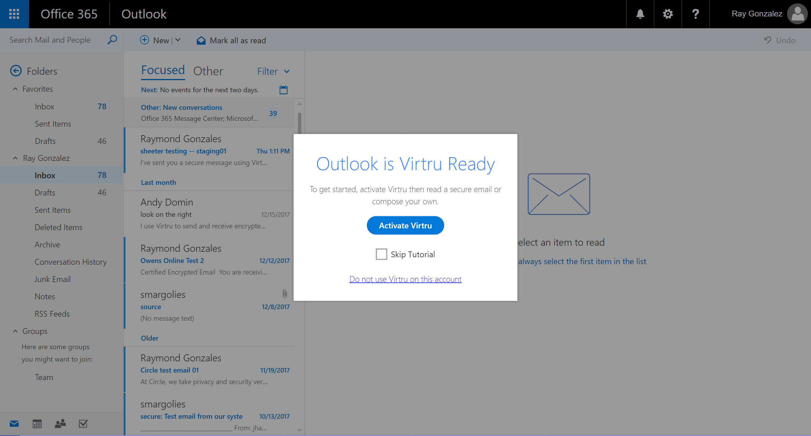
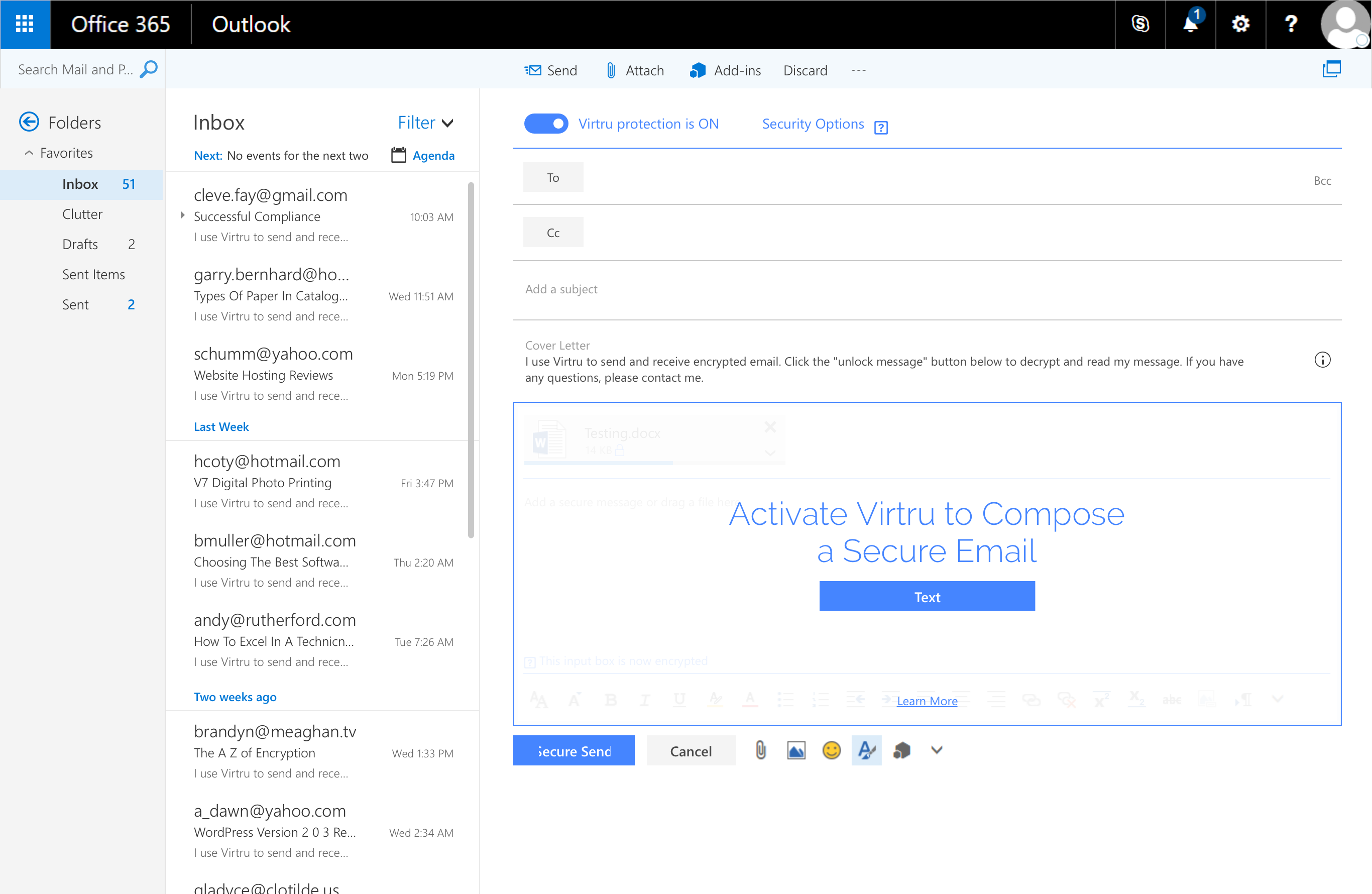
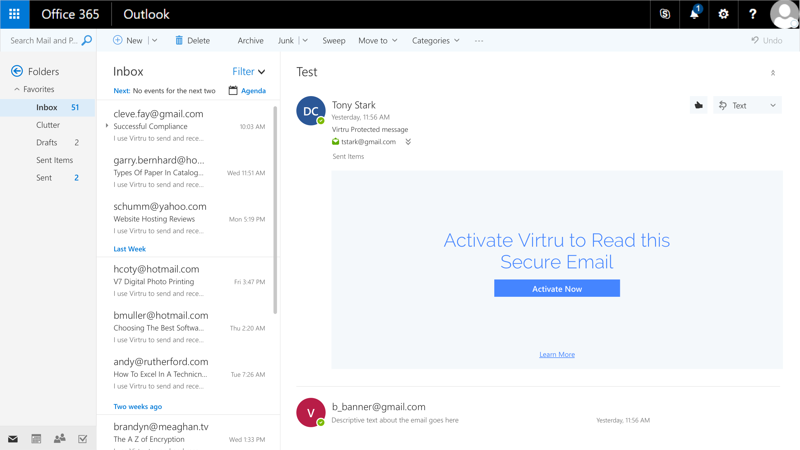
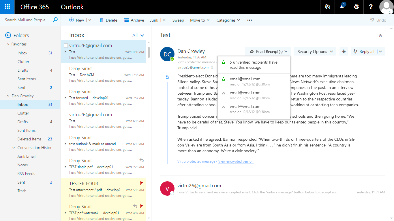
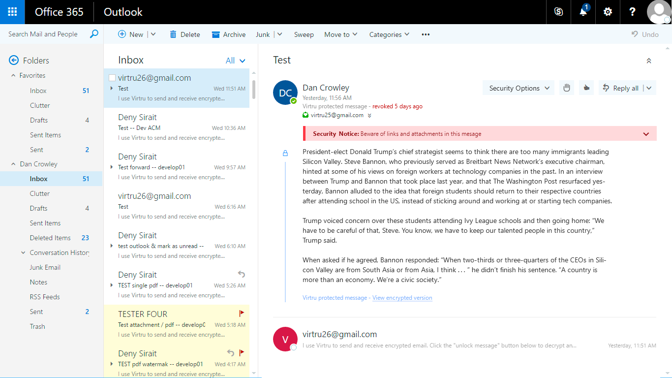
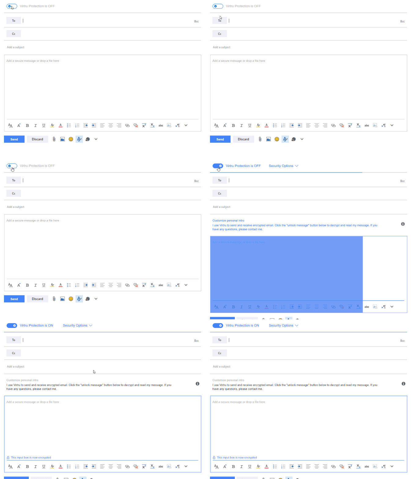
Here are a few images of the final results. The entire experience was much larger than what is depicted here, but hopefully it will give you a glimpse into the work that was done.
